Salesforce Canvas App: How to Make It Available on Salesforce1
Developer Guide
Contents
Introduction
Step 1 - Embed the App in a Visualforce Page
Step 2 - Enable Mobile Navigation
Step 3 - Enable the Mobile Browser App
Step 4 - Visibly Promote Your Application in Salesforce1 with an Icon/Logo
Good to Know
Challenges
Good to Go
Introduction
As more and more users access data and applications over mobile devices, multi-device application support is becoming increasingly important. Want to make your Force.com Canvas application available for the new Salesforce1 mobile app? Here’s how we did it, using just a few simple steps that you can follow, too.
Tools You'll Need
We used these frameworks and technologies to make Spanning Backup available for Salesforce1:
Angular JS
Twitter Bootstrap
Underscore.js
Moment.js
jQuery
Syntactically Awesome Stylesheets (Sass)
Node.js
MySQL
Step 1 - Embed the App in a Visualforce Page
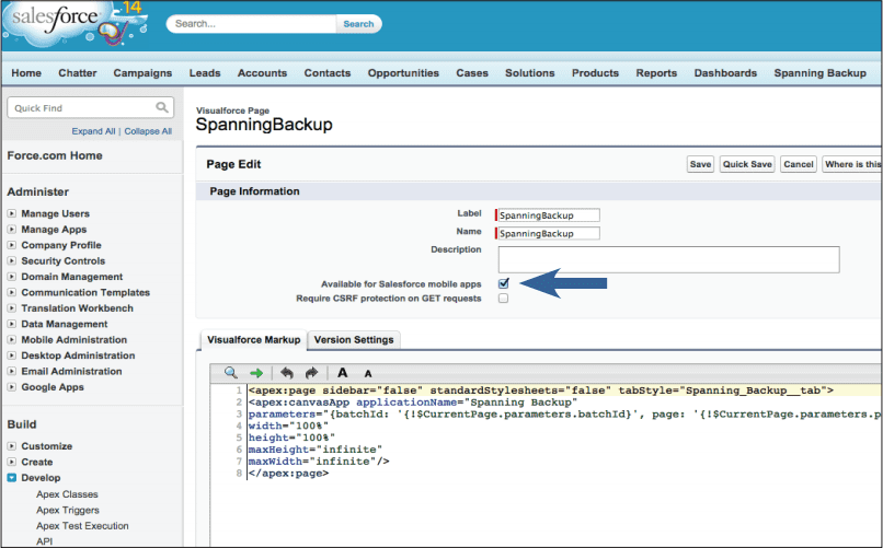
To make your Canvas app available in Salesforce1, you’ll need to first embed it into a Visualforce page. Navigate to the Develop menu by clicking Setup then Develop. Then select Pages, and Edit the page associated with your Canvas app.
Next, check the option “Available for Salesforce mobile apps.” If you weren’t using a Visualforce page to provide your Canvas app before, be sure the Visualforce page location is enabled. Do this by editing your app in the Apps view of Salesforce.
Step 2 - Enable Mobile Navigation
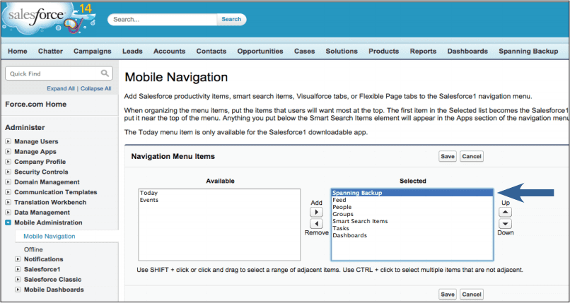
To expose your app in the Salesforce1 menu, you’ll need to enable mobile navigation. Do this by navigating to the Mobile Administration menu and then selecting the Mobile Navigation link. The Visualforce page you just enabled for mobile apps in Step 1 should now be listed in the “Available” section. Select it and click the right arrow to add it to the Selected list.
Step 3 - Enable the Mobile Browser App
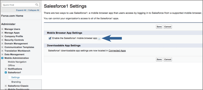
While this step is optional, it adds some value by enabling a web-based version of Salesforce1 to load automatically when users log into Salesforce from a mobile browser. This will give users another way to use your app in Salesforce1. Consider including it as an option in the install instructions for your application.
Step 4 - Visibly Promote Your Application in Salesforce1 with an Icon/Logo
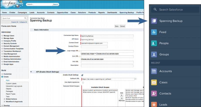
Create a custom icon that relates to your company brand and is easily identifiable. The icon is much more prominent in Salesforce1 than in the desktop version of Salesforce and can make a lasting impression on users interacting with your app. Your icon is provided via a publicly available HTTPS URL. This value can be set from your connected app configuration page (Go to Setup > Manage Apps > Connected Apps).
Good to Know: Tips from Spanning’s Experience
Web Application Changes to Ensure Optimal Display on Any Mobile Device
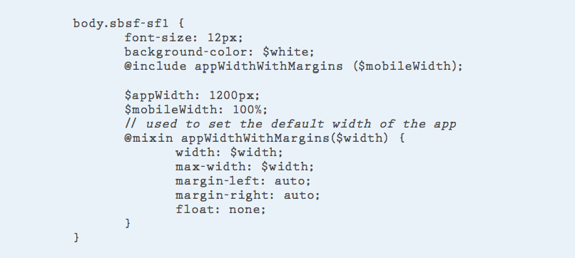
We had to make a few web application changes to enable Spanning Backup for Salesforce to run seamlessly inside the Salesforce1 app. Our main concern was making sure that the app could detect whether it was being loaded through a mobile device or on a desktop. In order to do this, we used the code in http://detectmobilebrowsers.com. This is important because on the desktop, the width is fixed at 1200px inside the Visualforce page. To be responsive to the device in use, that width would need to automatically stretch to 100% if the app detected a mobile device.
To accomplish this, we decided to add a CSS class to the main container and then direct the application to the mobile view. We specifically added the “sbsf-sf1” class to our top level DOM (document object model) (Image 1). For mobile devices, we use ems to scale for different form factors. (Note the different width variables for desktop and mobile devices.) This snippet was written in Sass.
A few additional CSS rules (Image 2) should be considered for your application. These were taken from the Canvas developer guide and are helpful in ensuring your application is always visible regardless of how small the display may be. Setting the overflow will ensure that the app is scrollable and won’t clip any content.
Ensure that the outermost div elements contain the following properties.

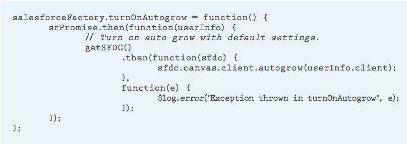
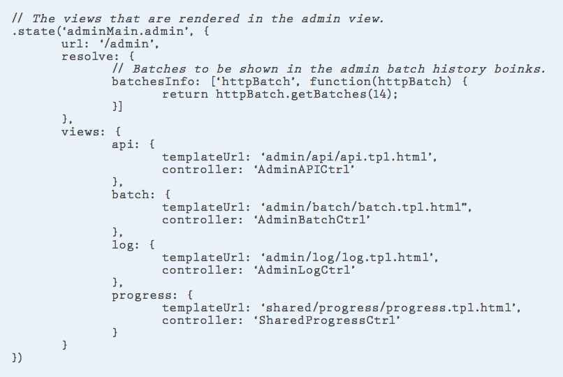
Finally, you’ll need to turn on autogrow via the Canvas JavaScript SDK in order to best fit the different sizes of display available on mobile (Image 3). That way, the app will take all available content space when loaded in Salesforce1. (NOTE: You want to avoid having a scrollable area smaller than the content view.) This function is specific to Spanning’s Angular JS application, so your app might look slightly different, however, the important thing to note is the call to the Canvas API to turn on the autogrow feature. Note that userInfo.client is the client property provided to us by Salesforce in the signed request that is posted to the app on load.
Layout and Design Considerations in Mobile Environment
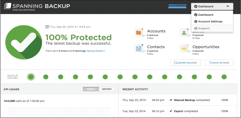
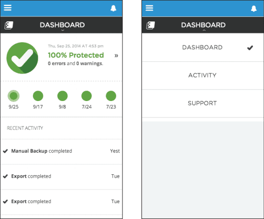
Remember that desktop and mobile environments offer different types of user interactions, and design multi-device apps accordingly. For example, portable devices do not have mouse-over and hover interactions or double-click events. Also, interactions with components must be designed to accommodate differences. For example, because there is so much more space to work with in a desktop app environment (Image 4), a drop-down menu makes sense for navigation. Conversely, in a mobile device (Image 5), where space is limited, the header also becomes the navigator and toggles between the main view and the navigator menu.
Reusing Components
When developing the mobile version of Spanning Backup for Salesforce, we were able to reuse a number of our controllers and, for most instances, simply built mobile versions of the templates for the views. We also reused many utilities from our desktop app such as HTTP and services, filters and constants components. We were also able to reuse many of the CSS files and created a mobile-specific CSS that we would use if we were loading the app inside a mobile device.
Helpful Tools for App Verification
The biggest challenge in developing an app for mobile is verifying that it looks and works as expected on the different form factors; screen sizes vary significantly even if you limit your scope to iOS and Android devices. Also, mobile browsers can present a challenge by behaving differently where things should theoretically all work the same way.
Start with Google Chrome’s built-in emulation.
When initially verifying your app, start with the Chrome browser in your first pass at structure and function. Chrome’s developer tools include a built-in emulation capability that will allow your desktop browser to resize and work as a mobile browser. Salesforce has made this easier in this regard by exposing Salesforce1 in the desktop browser via a specific URL for your developer instance. To view Salesforce1 in your browser, log into salesforce.com and update the URL to point at your instance/one/one.app. For example, in our instance, the URL would be https://ns15.salesforce.com/one/one.app.
Next, you’ll need to enable the Chrome emulator. Do this by opening the Developer tools via the “hamburger” menu on the far right of your URL bar (Tools > Developer Tools). Select the Emulation tab in the lower section. Select a device and click the Emulate button. This puts you one refresh away from being able to view your Canvas app in Salesforce1 on your desktop and debug it using the usual Chrome developer tools.
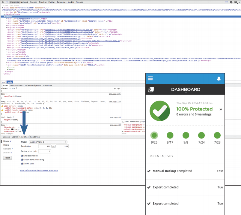
Inspect the DOM, view CSS styling, and debug JavaScript as you normally would for a web application.
Move on to emulators for different mobile form factors.
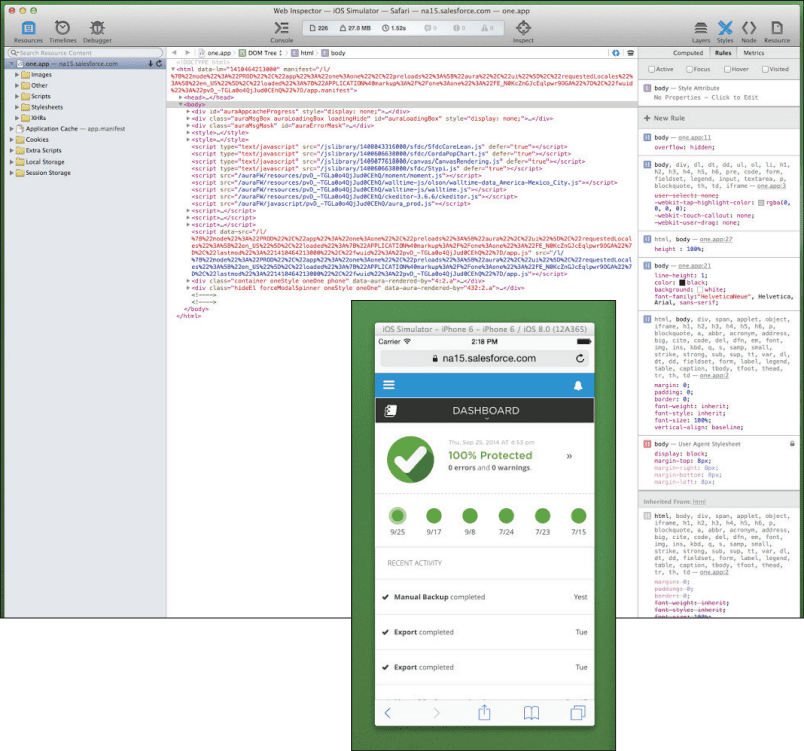
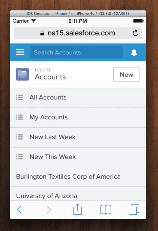
Mac: Start with the iOS emulator that’s launched through XCode. (If you’ve never installed XCode, there are many resources out there with installation walk-throughs.) Once you have XCode installed, the emulator can be launched by selecting XCode from the menu bar, then navigating to Open Developer Tool > iOS Simulator. You will not be able to install the native Salesforce1 application on the emulator, but you can view Salesforce1 in Safari. This is close enough to identify any major issues that will arise in native Salesforce1.
After opening your app in Salesforce on Safari in the emulator, connect a debugger from your desktop version of Safari. Open Safari and enable the Develop menu in the Advanced tab of the settings. Then you should have a Develop option in the menu bar for Safari. Click Develop > iPhone Simulator and pick your Salesforce instance from the list of open webpages. Much like with the Chrome developer tools, you can now dig into code running in the mobile browser.
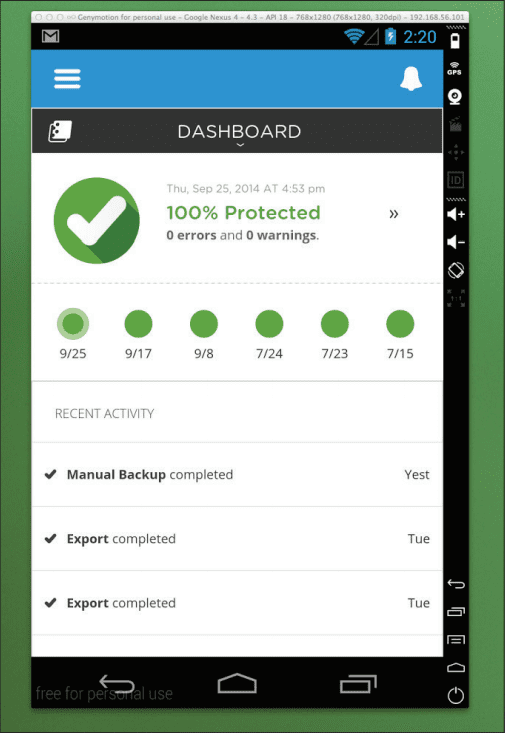
Android: We found testing on Android to be more challenging. The downloadable Android SDK comes with an emulator, but it is painfully slow and there’s no way to install the Salesforce1 application out of the box. The alternative we found was a pre-configured emulator from Genymotion that performs much better than the default emulator. With some “googling”, you can also easily get the Google Play store installed so you can actually test your application in the Salesforce1 native app. We never found a good way to debug on the emulator, so we had to respond with a guess-and-check method. You will need to make your development machine visible to the emulator so that the Canvas app can load. We did this by adding the hostname to our local machine’s hosts file and configuring a static IP for that host on the router.
Finally, verify the app on devices.
When you’ve passed the gauntlet of web and mobile browsers in emulation, it’s time to verify your app on devices. The web application behind your Canvas app will need to be publicly accessible in order to view it in the native Salesforce1 app. We accomplished this by installing our application on a staging server and using a test Salesforce instance. If all your emulator testing has done its job, the app should work on any device.
Challenges
Test, test, test.
As with all mobile development, not everything always worked perfectly. The rule of thumb we established is that everything will work as it should on the Chrome emulator and then fail differently on iOS and Android - so always test on devices whenever possible.
With Salesforce1 being so new, we also faced issues such as long pages and an inability to scroll to the bottom of the page. There were open support cases with Salesforce for all bugs we found, and we’re confident they will be addressed in future releases.
Work proactively with your UI design team.
Be sure to work closely with your design team to ensure everything they dream up will be possible in Salesforce1. One problem we encountered was trying to fix a header to the top of our application and only scrolling the body when necessary. The way the Canvas app is rendered in Salesforce1, fixing a header wasn’t impossible, but would have been tough. So we worked with our design team to find an alternate solution.
Good to Go: Delivering the Ultimate Mobile Experience to Salesforce Users
With the Salesforce1 mobile application, users enjoy in a mobile environment everything they normally expect to find in their desktop Salesforce application. You can make your app part of their experience by first using Force.com Canvas to expose it as a Canvas app - i.e., a web app that’s hosted on your server and embedded in the Salesforce UI.
Once you’ve exposed your app as a Canvas app, just follow the steps at beginning of this guide to make it available in Salesforce1. It’s definitely easier than building a native application from the ground up for all the major platforms - not to mention an accompanying responsive web application for users who prefer the browser.
Leveraging Canvas to deliver your application to Salesforce desktop and mobile users offers a number of advantages:
- Your app can be placed on most views inside Salesforce. You can use existing skills (HTML/CSS/JavaScript) with very little Salesforce configuration and provide an integrated experience for Salesforce users.
- There’s an SDK provided that enables your application to adjust to the environment. It can resize based on the space provided, or alter what view will be shown depending on where it is being rendered.
- Authentication and access is controlled as part of the installation so you don’t have to jump through OAuth hoops to access an organization’s data. For more information about what data is provided when your app is launched, view the ‘Signed Request’ section of the Canvas documentation.
So go ahead: Get out there and stretch your mobile development muscles by making your app part of Salesforce1.
Interested in learning more about Spanning Backup for Salesforce? Visit the product page below.
Spanning Backup for Salesforce
A PDF version of this whitepaper is also available. Click the button below to download it instead:


